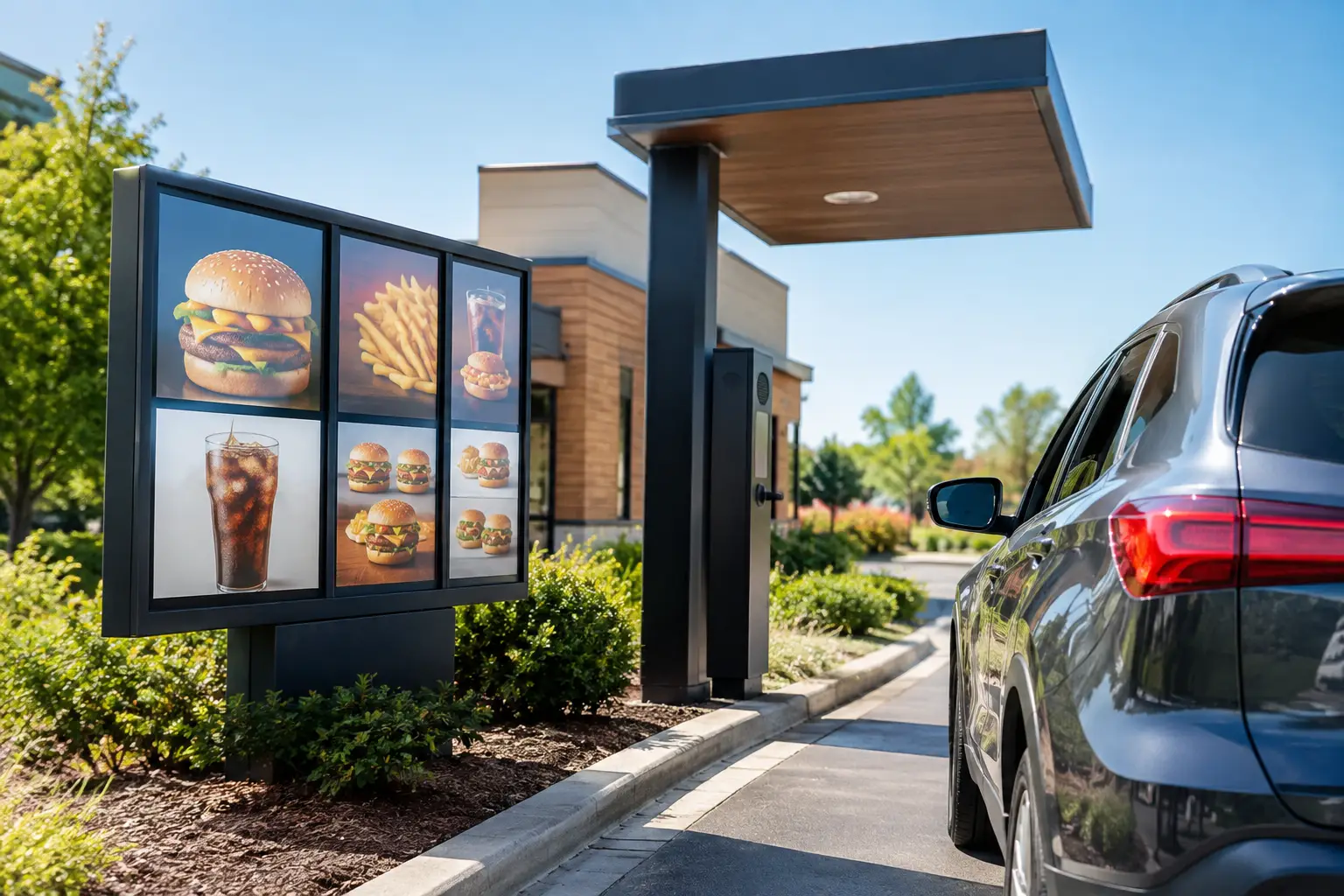
A drive-thru customer makes several decisions before reaching the pickup window: where to enter, where to queue, what to order, and where to pay. The best restaurant drive thru signage makes each decision obvious without making customers slow down, second-guess the lane, or block traffic. For busy restaurants, that clarity directly supports speed of service, order accuracy, and a better first impression.
A strong drive-thru sign package is not one large sign near the street. It is a coordinated system that starts with site visibility and continues through the menu board, directional signs, lane markers, payment instructions, pickup guidance, and exit messaging. Every piece should look like it belongs to the same restaurant and work under real operating conditions: daylight, nighttime, rain, traffic, and a lunch rush.
What the Best Restaurant Drive Thru Signage Does
The most effective signage answers a question before the customer has to ask it. From the roadway, it confirms that the restaurant is there and identifies the entrance. At the property line, it tells drivers where the drive-thru lane begins. At the menu board, it presents choices clearly enough to support quick ordering. Near the window, it guides payment, pickup, and exit flow.
This matters because a drive-thru is a moving environment. Customers are reading while navigating turns, watching other vehicles, talking to passengers, and often deciding what to order. Signage that is attractive but difficult to scan can create hesitation. Signage that is clear but visually disconnected from the brand can make a location feel temporary or poorly maintained. The right solution has to do both jobs well.
For Houston restaurants, visibility also has to hold up against intense sun, sudden rain, humid conditions, and long operating hours. Material selection, LED lighting, mounting methods, and finish quality are operational decisions, not just design details.
Start With the Customer Route, Not the Menu Board
Many restaurant projects begin with the menu board because it is the most recognizable drive-thru sign. But the customer journey begins much earlier. A driver should be able to spot the restaurant from the road, recognize the correct entrance, and understand the lane configuration before reaching the ordering point.
A monument sign, pylon sign, illuminated cabinet sign, or channel letter sign may be the first visibility tool, depending on the property, road speed, setback, and local sign requirements. A restaurant tucked into a retail center may need strong storefront identification and a clean directional sign at the turn-in point. A freestanding location near a major thoroughfare may need a taller, more visible identification sign that can be recognized well before the entrance.
Once drivers are on-site, directional signage takes over. Simple messages such as “Drive-Thru Entrance,” “Order Here,” “Pay Here,” and “Exit Only” should be placed where they are needed, not after the decision point has passed. Arrows need to be unmistakable. If a site has dual lanes, merge points, mobile pickup spaces, or separate delivery traffic, the sign plan should address those movements specifically.
Build a Menu Board for Fast Reading
A menu board has more information than most drive-thru signs, which makes hierarchy essential. Customers should see the restaurant’s featured items, core categories, pricing, and ordering prompts in a natural order. They should not have to hunt through dense copy or tiny product images while other cars wait behind them.
Large type, meaningful spacing, strong contrast, and limited message competition do more for usability than trying to place every possible offer on one panel. Promotions are valuable, but they should not bury best sellers or ordering instructions. If a limited-time offer changes regularly, use a changeable panel or digital display strategy rather than redesigning the full board each time.
Digital menu boards can be a smart fit for restaurants with frequent daypart changes, rotating promotions, or multiple locations that need consistent campaigns. They also require a plan for brightness, content management, service access, and eventual maintenance. A static illuminated board may be the better choice for a focused menu with fewer updates and a straightforward budget. The best option depends on how often the menu changes and who will manage it after installation.
Use Contrast That Holds Up at Noon and at Night
Color choices should support readability, not simply repeat the brand palette. A high-contrast layout helps customers read quickly in bright Texas sunlight, while internal illumination or properly aimed external lighting keeps essential information visible after dark.
Glossy faces, reflective materials, and poorly positioned lighting can create glare. Dim LEDs and uneven illumination can make a professional restaurant look neglected. During the design phase, review how the sign will perform from a vehicle at different times of day, not only how it appears in a digital proof.
Give Every Sign One Clear Job
Drive-thru lanes become confusing when signs compete with one another. A customer should not see a cluster of messages about ordering, payment, parking, mobile pickup, delivery drivers, and promotions all in one glance. Assign each sign a primary purpose and place it at the point where that information becomes useful.
For example, a pre-menu board can communicate lane choice or current promotions. The main menu board should focus on ordering. A small sign near the speaker can explain app scanning or rewards instructions. Window graphics can reinforce payment methods or pickup directions. Exit signs should be visible early enough to prevent drivers from making abrupt turns.
When a restaurant has a second ordering lane, a clear “Use Both Lanes” sign can reduce one of the most common traffic problems. If both lanes merge before the payment window, the merge should be supported with pavement markings and signs that set expectations. A sign package works best when it supports the physical layout rather than trying to correct a poor traffic pattern after the fact.
Choose Materials Built for Restaurant Operations
Drive-thru signage takes more abuse than many other commercial sign types. It is exposed to vehicle exhaust, rain, landscaping equipment, cleaning chemicals, occasional impacts, and constant use. Materials should be selected for durability, cleanability, and serviceability.
Aluminum cabinets, durable acrylic faces, weather-resistant vinyl graphics, powder-coated metal components, and commercial-grade LED lighting are common choices because they perform well in demanding conditions. Protective bollards may be appropriate near menu boards, clearance bars, and payment equipment where drivers have limited turning room.
Maintenance access should be considered before fabrication. Can lighting be serviced without disrupting the lane for an extended period? Can a promotional panel be changed without replacing permanent graphics? Will the menu layout still work when pricing or products change? Planning for these realities can prevent unnecessary expense later.
Keep the Brand Consistent From Roadside to Pickup Window
A customer may first see a building sign from several hundred feet away, then spend several minutes in the drive-thru lane. That is a long brand interaction. The colors, typography, logo treatment, and finish quality should remain consistent from the primary building sign to the smallest directional marker.
Consistency does not mean every sign has to look identical. A roadside sign needs immediate recognition. A menu board needs organized information. A window decal may need a short instruction. Each format has a different role, but all should feel connected. This is especially valuable for franchise operators and multi-location restaurant groups that need customers to recognize the same experience at every store.
A polished system also supports trust. Faded graphics, handwritten instructions, mismatched panels, and burned-out lighting send a message even when the food and service are excellent. Regular sign maintenance protects the investment and keeps the location looking established.
Plan for Permitting, Installation, and Future Changes
Drive-thru signage can involve property standards, municipal regulations, electrical requirements, visibility considerations, and landlord approvals. Freestanding signs, illuminated signs, wall signs, and site directional signs may each have separate requirements. Addressing permitting early keeps a project from reaching the production stage only to require a redesign.
Installation should also be coordinated around restaurant operations. A menu board replacement, new pylon sign, or lane reconfiguration may require temporary traffic control and careful scheduling to avoid peak periods. Working with a full-service commercial sign company helps keep design, permitting, fabrication, installation, and ongoing service aligned under one plan.
A to Z Sign Company helps Houston-area restaurants create professional signage and visual branding solutions that are built around real site conditions, customer flow, and long-term visibility. The goal is not simply to place signs around a lane. It is to create a drive-thru experience that feels clear, efficient, and ready for the next car in line.