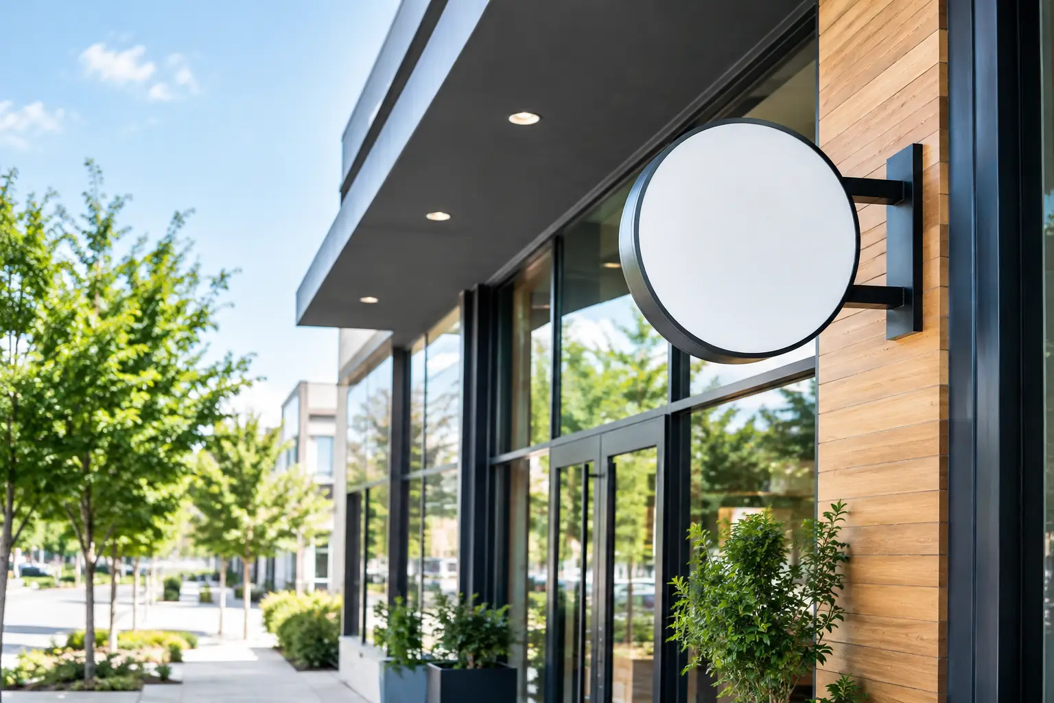
A sign has only a few seconds to do its job. From a busy Houston roadway to a walkable retail center, customers need to recognize your business, understand where to enter, and feel confident they have found the right place. The most useful business signage trends are not about chasing a look for its own sake. They are practical upgrades that improve visibility, strengthen brand consistency, and hold up in demanding commercial environments.
For business owners, property managers, and multi-location operators, the right direction starts with a simple question: what does your location need customers to notice first? That answer should guide every choice, from illumination and letter height to materials, graphics, and wayfinding.
Business Signage Trends Built Around Clear Branding
The strongest trend in commercial signage is cleaner, more intentional branding. Businesses are moving away from overcrowded cabinets, excessive copy, and design elements that disappear at driving speed. Instead, they are using high-contrast logo treatments, simple color systems, readable type, and sign layouts that communicate quickly.
This approach works especially well for channel letter signs, monument signs, office lobby displays, and window graphics. A restaurant may need its name and entrance to stand out after dark. A medical office may need a polished monument sign that helps new patients identify the correct building without adding visual clutter. The objective changes, but the principle stays the same: make the essential information easy to see.
Minimal does not mean plain. Dimensional letters, layered acrylic, routed metal panels, and carefully selected finishes can give a sign depth and authority without making it busy. For established businesses, this often produces a more premium result than trying to fit every service, phone number, and message into one permanent sign.
Brighter, More Efficient LED Illumination
LED illumination continues to lead commercial sign upgrades because it delivers consistent brightness with lower energy use and less maintenance than older lighting systems. Front-lit channel letters remain a reliable choice for storefronts, while halo-lit letters create a refined appearance for offices, professional services, and upscale retail spaces.
Internally illuminated cabinet signs and LED message centers also remain valuable when visibility from a distance matters. A pylon sign near a major corridor, for example, may need large illuminated tenant panels that can be read well before a driver reaches the entrance.
Brightness should be planned for the site, not selected by default. An overly bright sign can create glare, wash out brand colors, or conflict with property standards. The correct illumination level depends on surrounding light, viewing distance, local requirements, and whether the sign faces traffic, pedestrians, or both.
Digital Displays for Time-Sensitive Messages
Digital LED signs are becoming more targeted. Rather than treating a display as a constant stream of messages, businesses are using it for information that changes often: daily specials, event notices, service updates, tenant announcements, enrollment periods, or seasonal promotions.
This can be a smart fit for restaurants, schools, churches, retail centers, and service businesses with changing offers. It is less useful when a business primarily needs a permanent identity marker. A digital display cannot replace a strong primary sign. Customers still need to recognize the name, logo, and location at a glance.
Before adding an LED message center, confirm what the property, municipality, and applicable sign code allow. Digital signage may involve limits on size, brightness, message duration, placement, or animation. Planning permitting early prevents a promising concept from becoming an expensive redesign.
Flexible Graphics Are Expanding the Sign Package
Permanent exterior signage is only one part of how customers experience a business. Window graphics, wall graphics, floor decals, banners, and vehicle graphics are increasingly used as coordinated extensions of the main sign package.
For a storefront, window graphics can add privacy, promote key services, show operating hours, or turn unused glass into branded space. For an office or medical facility, interior wall graphics and dimensional logo displays can make the reception area feel finished and credible. For field-service companies, branded vehicle graphics turn every route into a mobile visibility opportunity.
The trend is toward consistency across these surfaces. A customer who sees a company vehicle, walks into its lobby, and receives a service at its location should encounter the same colors, logo treatment, and professional standard.
Flexibility matters, but materials matter too. Temporary promotional graphics should be easy to update and remove. Long-term window films need to resist fading, bubbling, and edge lifting. Houston heat, humidity, heavy rain, and strong sun can expose weak material choices quickly. Selecting the right vinyl, laminate, adhesive, and installation method protects the appearance of the finished work.
Wayfinding That Reduces Friction
As commercial properties become larger and more complex, wayfinding is becoming a bigger part of the signage conversation. Customers should not have to circle a shopping center, search for a suite, or guess which entrance serves their destination.
Clear directional signs, tenant panels, parking markers, suite signs, room identification, and ADA signage make a property easier to use. This is particularly important for medical facilities, office buildings, schools, industrial campuses, and multi-tenant developments.
Good wayfinding is functional first, but it should still match the property’s visual identity. Consistent colors, arrows, typography, and mounting styles make a site feel organized. Poorly matched signs added over time can make even a well-maintained property look confusing or neglected.
Durable Materials Are a Business Decision
One of the most practical business signage trends is a greater focus on lifecycle value. The lowest upfront price is not always the lowest cost over several years. Exterior signs must contend with UV exposure, moisture, wind, temperature changes, electrical components, and routine cleaning.
Aluminum, acrylic, polycarbonate, formed plastic, high-performance vinyl, and properly finished steel all have their place, depending on the sign type and location. The best material is not universal. A monument sign near a high-traffic entrance has different structural and finish requirements than interior dimensional letters in a climate-controlled lobby.
Durability also includes serviceability. LED modules, power supplies, cabinet faces, mounting hardware, and graphic panels should be planned so future repairs or updates are manageable. For multi-location brands and commercial properties, standardized sign specifications can reduce surprises when a new site opens or a damaged sign needs replacement.
Custom Work Still Matters More Than Copying a Trend
A common mistake is selecting a sign style because it looks good on another business. A sign that works for a boutique in Rice Village may not provide enough visibility for a service company along a busy suburban thoroughfare. A sleek, non-illuminated sign may fit an office corridor but fall short for a restaurant open after sunset.
The most effective signage starts with site conditions: setback from the road, traffic speed, building architecture, existing sign bands, landscaping, nearby competition, lighting, and property rules. From there, the design can support the brand while meeting practical visibility needs.
This is also where a coordinated proof-to-install process makes a difference. Before production begins, the design should account for dimensions, colors, illumination, mounting, landlord criteria, and permitting requirements. A polished rendering is helpful, but the finished sign must work on the actual building and at the actual viewing distance.
Plan for Visibility Before the Grand Opening
New locations, remodels, and rebrands create the best opportunity to build a complete sign plan rather than addressing needs one at a time. Exterior identification, window graphics, interior branding, ADA signs, directional signs, and vehicle graphics should support one clear customer experience.
For projects in Houston and surrounding communities, permitting and installation timing should be part of the early schedule. Sign approvals, electrical needs, landlord review, fabrication, and site access can all affect an opening date. Bringing those details into the planning stage helps avoid last-minute temporary solutions that do not reflect the quality of the business.
The right sign does more than fill a blank wall or mark an address. It gives customers a clear reason to notice your business, trust what they see, and walk through the right door.