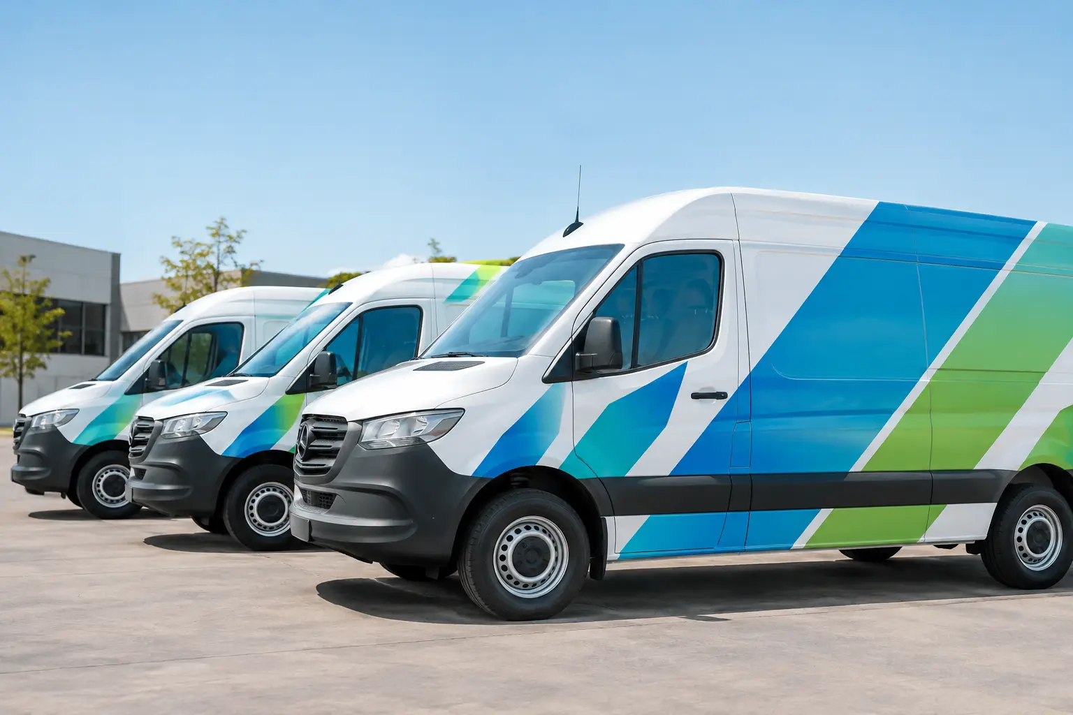
A fleet van that passes through Houston traffic all day has only a few seconds to make an impression. The best graphics for fleet vans do not try to say everything. They make the company name, service, and contact path easy to recognize from a distance, while giving every vehicle a clean, established appearance.
For service companies, delivery teams, contractors, healthcare providers, and multi-location businesses, van graphics are more than decoration. They are working brand assets. A well-planned vehicle can build recognition on a jobsite, in a parking lot, at a customer’s home, and on the road between appointments.
Start With the Message Drivers Need to See
The strongest fleet graphics begin with a clear communication hierarchy. Most people will not be standing beside your van long enough to read a paragraph. They should be able to identify who you are, what you do, and how to take the next step at a glance.
Your company name or logo should carry the most visual weight. The primary service should follow closely, especially when the brand name does not explain the business. A plumbing company, for example, may lead with its logo and use a concise line such as “Plumbing and Drain Services.” A restaurant delivery fleet may prioritize the brand name, location cue, and ordering information.
Phone numbers, websites, QR codes, and license information can all have a place, but they should not compete with the main message. A QR code can be useful when customers see a parked vehicle, but it is not a substitute for readable contact information. If a design only works when someone is standing three feet away, it is not doing enough work on the road.
Choose the Right Coverage Level
Fleet van graphics are not one-size-fits-all. The right approach depends on your budget, vehicle mix, service area, and how often vans are visible to the public.
Lettering and Spot Graphics
Cut vinyl lettering and spot graphics are a practical choice for businesses that need a clean, professional fleet appearance without covering the entire vehicle. This option typically includes a logo, primary services, phone number, and simple graphic elements on the doors, rear, and side panels.
It works well for companies with newer white vans, a straightforward brand palette, or a large fleet that needs consistent branding at a controlled cost. The trade-off is that simple lettering may not stand out as strongly in dense traffic or against a busy commercial backdrop.
Partial Wraps
A partial wrap uses printed vinyl on selected areas of the van, often paired with matching cut lettering. It can create a more custom, high-impact look without the cost of a full wrap. A bold color block, branded pattern, product image, or large service visual can give the vehicle real presence.
This is often the best middle ground for Houston businesses that want their fleet to look polished and recognizable while keeping production costs in line. The design should use the vehicle’s natural body lines intentionally. Random shapes or graphics that stop awkwardly at panel seams can make even premium materials look unfinished.
Full Vehicle Wraps
A full wrap covers most or all painted surfaces with printed vinyl. It offers the greatest flexibility for bold color, photographic imagery, patterns, and large-scale branding. Full wraps are especially effective for companies with a strong visual identity, consumer-facing services, or vehicles that spend long hours in high-traffic areas.
A full wrap is a larger investment, and it demands disciplined design. More available space does not mean every panel needs more information. Clean negative space, strong logo placement, and readable type are what make a full wrap feel premium rather than crowded.
Design for the Shape of the Van
Vans are not flat billboards. Door handles, sliding doors, fuel doors, windows, body contours, and rear hinges all affect how graphics should be placed. A design that looks balanced on a computer screen can become hard to read when a logo is split across a sliding-door seam or a key message disappears around a wheel well.
The side panels usually offer the largest opportunity for brand recognition, but the rear doors deserve serious attention. Drivers often spend more time behind a van at a stoplight than beside it. Rear graphics should clearly identify the company and provide a simple way to contact it, without placing essential copy too low or too close to hinges and lights.
Keep doors, handles, required safety markings, and fleet identification functional and accessible. If a van has windows, perforated window film can extend the visual design while maintaining outward visibility where appropriate. The exact layout should be confirmed against the specific year, make, model, and roof configuration of each vehicle in the fleet.
Color and Contrast Matter More Than Complexity
The most memorable van graphics are usually built on a limited color system. Your existing brand colors should lead the design, but they still need to perform under real conditions. A dark logo on a dark-colored van, thin pale lettering on reflective glass, or low-contrast copy on a photo background can disappear quickly.
High contrast improves readability from the street. Large white lettering on a deep blue field, black copy on a bright solid color, or a bold logo on a clean white panel are proven approaches because they remain visible in motion. This matters even more in Houston, where bright sun, rain, glare, and heavy traffic can change viewing conditions throughout the day.
Avoid treating every empty area as space that needs a graphic. Open space gives your main message room to work. It also makes the vehicle look more organized, which supports the professional image customers expect from a company entering their property or arriving at their business.
Use Materials Built for Field Work
A vehicle graphic has to hold up beyond the installation day. Fleet vans face heat, ultraviolet exposure, road grime, rain, regular washing, parking-lot contact, and constant opening and closing of doors. Material selection should reflect how the vehicle is actually used.
Premium cast vinyl is generally the right choice for wraps and long-term graphics that need to conform around curves, channels, and complex panels. Lamination adds protection against fading, scratches, and everyday wear. Lower-cost materials may make sense for short-term promotions or simple flat-panel applications, but they are not always the best value for a vehicle expected to represent your company for years.
Preparation and installation are just as important as the vinyl itself. Vehicles should be clean, dry, and free from surface issues that could affect adhesion. Professional installation helps prevent lifting edges, trapped debris, misaligned panels, and graphics that fail early around door seams or recessed areas.
Keep Every Vehicle Consistent, Not Necessarily Identical
A fleet can include cargo vans, sprinter vans, pickups, box trucks, and specialty vehicles. Trying to force the exact same layout onto every vehicle can create problems because each body style presents different usable space.
The goal is consistent branding, not identical placement. Use the same logo treatment, primary colors, typography, service language, and visual style across the fleet. Then adjust the layout so each vehicle type looks intentional. A cargo van may have a large side-panel message, while a pickup may rely more on door graphics and a tailgate treatment.
This consistency helps customers recognize your company whether they see one van in the Energy Corridor or several vehicles arriving at a commercial property. It also makes future fleet additions easier. Once the visual system is established, new vehicles can be branded quickly without redesigning the entire concept.
Common Problems That Weaken Fleet Graphics
The biggest mistakes are usually not production problems. They are planning problems. A design becomes hard to use when it includes too many services, too many type styles, a tiny logo, or a phone number that cannot be read from another lane.
Another common issue is choosing a design based only on a digital proof. A proof is essential, but the final question should be practical: Can someone identify this vehicle while it is moving? Can they understand the service from across a parking lot? Does it still look professional after road dust and a busy workday?
It also pays to plan for change. If your company expects to add locations, launch a new service, update a website, or acquire additional vehicles, build flexibility into the graphic system. A good design should support growth without becoming expensive to revise.
A Clear Process Produces a Better Fleet
The best results come from a coordinated design, production, and installation process. Start with your logo files, approved brand colors, service priorities, vehicle list, and any required regulatory information. From there, a vehicle-specific proof can show how the graphics will sit on the actual van model before production begins.
Review proofs for readability, spelling, color balance, and placement before approving the job. If several vans are involved, confirm whether they are all the same model and whether each vehicle has different dents, accessories, ladders, windows, or existing graphics to address. These details protect the schedule and help create a clean final result.
A to Z Sign Company helps Houston businesses turn fleet vehicles into professional signage and visual branding solutions, from design through production and installation. The right van graphics should make every service call look like a confident introduction to your business.
Leave a Reply