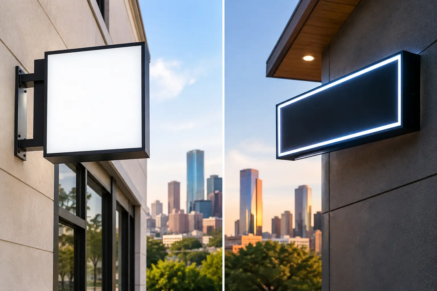
A cabinet sign has one job before a customer ever walks through the door: make your business easy to find and easy to recognize. This LED cabinet sign comparison focuses on the choices that affect that outcome most, from illumination and face material to cabinet depth, viewing distance, and long-term service needs. For Houston businesses, the right answer is rarely the brightest or least expensive option. It is the sign built for your specific location.
LED Cabinet Sign Comparison: What Are You Comparing?
An LED cabinet sign is an enclosed, internally illuminated sign with a printed or applied graphic face. It may be mounted on a storefront wall, installed above a tenant space, placed on a pole or pylon, or incorporated into a monument sign. LEDs illuminate the face from inside the cabinet, making the business name, logo, or message visible after dark.
The biggest decision is usually not whether to use LEDs. LEDs are the standard for efficient, serviceable illumination. The real comparison is between a standard cabinet sign, a more customized cabinet with dimensional elements, and alternatives such as channel letters or digital message displays.
A standard illuminated cabinet works well when a business needs clear identification at a practical budget. It gives restaurants, retail tenants, service businesses, and commercial properties a large, readable sign face. Channel letters often create a more upscale, individual-letter appearance, but they can cost more and may not provide the same broad graphic area. Digital displays are useful for changing messages, yet they bring additional cost, content management, and potential code restrictions.
For many locations, a cabinet sign is the best balance of visibility, branding space, and maintainability.
Choose Illumination for Visibility, Not Just Brightness
LED modules provide consistent internal lighting with lower energy use than older fluorescent systems. That does not mean every cabinet should use the same number of modules or the same brightness level. A sign that looks sharp on a building in a shaded retail center can look washed out on a sun-exposed wall facing a busy Houston roadway.
Brightness should be matched to the sign face, viewing distance, surrounding lighting, and hours of operation. A storefront in Rice Village may need a polished, controlled look that fits close pedestrian viewing. A business along a major corridor or within a large shopping center may need stronger illumination and larger letterforms so drivers can identify it from farther away.
Overlighting creates its own problems. Excessively bright faces can reduce contrast, make lighter graphics appear flat, and create tension with property management or local regulations. Proper LED layout matters just as much as output. Poorly spaced modules can create hot spots, shadows, or uneven illumination across the face, especially with large cabinets and dark graphics.
Ask for a lighting plan that considers the finished sign as it will appear at night, not just a generic LED specification. The goal is clear, even illumination that supports your brand colors and remains readable from the street.
Face Material Changes the Look and Service Life
The face is the customer-facing surface of the sign, so its material deserves careful consideration. Acrylic sign faces are common because they provide a clean appearance and transmit light effectively. Polycarbonate can offer higher impact resistance in locations where damage is more likely. The right choice depends on cabinet size, exposure, and the type of graphics being used.
Most cabinet faces use translucent vinyl graphics, which allow light to pass through colored areas. This approach is ideal for logos, text, and simple brand color fields. Opaque vinyl can be used when a portion of the design should remain unlit. A layered graphic plan often creates a more refined result than treating the whole face as one glowing panel.
Large-format printed faces can support detailed imagery, gradients, and promotional graphics, but they need to be designed with nighttime viewing in mind. Fine details that look good on a proof may disappear from a roadway. Small type, low-contrast colors, and intricate images usually work against visibility.
For a business with an established logo, the best face design may be simple: recognizable colors, a strong logo mark, and readable copy. For a multi-tenant property or a business that expects regular promotional changes, replaceable graphic panels may be more practical than a permanent face treatment.
Cabinet Style Should Fit the Building and Brand
A basic aluminum cabinet with a flat face is durable, economical, and effective for many commercial applications. It is especially useful for tenant identification, wall signs, and pole-mounted signs where the message needs to be direct. However, a standard rectangular box is not the only option.
Custom-shaped cabinets can follow a logo silhouette or architectural feature. Routed faces with push-through acrylic elements can add depth and give a cabinet sign a more dimensional, premium appearance. Cabinets can also be paired with exterior dimensional letters, creating a layered presentation that is more distinctive than a fully illuminated face alone.
These upgrades have trade-offs. Custom shapes, routed elements, and multi-layer graphics require more fabrication time and usually raise the project cost. They may be worth it for a flagship restaurant, medical office, or professional service brand where the storefront needs to communicate quality before the customer enters.
For a warehouse, service center, or industrial property, a straightforward cabinet may be the better investment. The best sign is not always the most elaborate one. It is the one that supports the building, the brand, and the way customers approach the site.
Compare Construction for Houston Weather
Houston heat, humidity, heavy rain, and storm exposure put commercial signage to work. Cabinet construction affects how well a sign holds up through those conditions. Look for durable aluminum fabrication, properly sealed seams, reliable drainage, and mounting engineered for the sign’s size and placement.
A cabinet can look good at installation and still develop problems early if water finds its way inside, electrical components are poorly protected, or the structure is not adequately secured. Condensation, faded graphics, corroded hardware, and intermittent lighting are avoidable issues when the sign is fabricated and installed correctly.
Service access also matters. LEDs last a long time, but no illuminated sign is maintenance-free forever. A cabinet should allow qualified technicians to access electrical components and replace modules or power supplies without damaging the face or requiring unnecessary removal. This is especially valuable for signs mounted high above storefronts, entry drives, or parking areas.
Location, Landlord Rules, and Permits Can Change the Best Option
Before selecting a cabinet size or design, confirm what the site allows. A shopping center may have a tenant sign criteria package that controls the sign’s dimensions, colors, cabinet depth, mounting method, and illumination. Office parks and medical complexes often have their own requirements as well.
Local sign regulations can affect placement, overall area, height, electrical work, and whether an existing nonconforming sign can be altered. A proposed cabinet sign may need to fit within a designated sign band or coordinate with a shared pylon structure. These requirements can influence the design before production begins.
That is why a site review should happen early. A polished proof is useful, but it does not solve a visibility problem caused by a low sign band, a blocked sightline, or a cabinet that is too small for its viewing distance. A to Z Sign Company helps clients coordinate design, permitting, fabrication, and installation so the finished sign works at the property, not just on paper.
Compare Cost by the Full Project, Not the Cabinet Alone
A low initial quote can overlook parts of the job that determine the final result. Sign size, aluminum fabrication, face material, LED components, electrical connection, installation equipment, permitting, engineering, and landlord review can all affect the total project scope.
A smaller sign with poor readability is not a bargain if customers still miss the location. Likewise, an elaborate cabinet may not be the right use of budget if the property already has excellent street visibility and needs only a clear tenant identifier. Start with the site and the customer journey: Where do people first see the business? Are they walking, driving slowly, or passing at road speed? What must they understand in a few seconds?
It also helps to consider future changes. If a business may update its services, add a second brand line, or change promotional graphics, a cabinet designed for replaceable faces can reduce future costs. If the logo is stable and the building calls for a more permanent statement, a custom cabinet or channel letter system may deliver greater long-term value.
Make the Decision From a Real Sign Plan
The most productive LED cabinet sign comparison starts with a site photo, building measurements, logo files, and a clear understanding of who needs to see the sign. From there, the design can account for scale, contrast, mounting height, lighting, property rules, and the overall appearance of the finished location.
A cabinet sign should do more than light up after sunset. It should make the business look established, guide customers to the right door, and continue representing the brand well after opening day. When the sign is planned around the property instead of selected from a one-size-fits-all option, visibility becomes a lasting business asset.
Leave a Reply